Heatwaves and Day-Ahead Prices: DE-LU, Summer 2019
energy
extremes
time-series
Analysis of electricity day-ahead prices in Germany-Luxembourg during heatwave events. Explores the relationship between extreme temperatures and energy market dynamics using operational heatwave definitions and descriptive statistics.
Published
December 12, 2025
Why this note exists
Heatwaves stress energy systems. Air conditioning demand spikes. Thermal power plants lose efficiency. Grid operators face the dual challenge of surging demand and constrained supply. This note asks a simple question: do electricity prices reflect this stress?
This is not a causal analysis. We’re not claiming heatwaves cause price spikes—too many confounding factors exist. Instead, we document an operational definition of a heatwave, trace it through a data pipeline, and observe what happens to prices when heatwaves occur. The pipeline is meant to be inspectable rather than “correct” in any final sense. Every choice—the 30°C threshold, the 3-day minimum duration, the peak hours definition—is explicit and debatable.
Data: Two Time Series, One Question
We need two things: electricity prices and temperature. The DE-LU day-ahead price represents the marginal cost of electricity in the German-Luxembourg bidding zone—the price at which the last unit of demand is satisfied. It’s a market signal that reflects supply-demand balance in real-time.
German temperature data provides the heatwave signal. We use Germany because it’s the dominant market in the DE-LU zone, and temperature is the primary driver of cooling demand. The data spans 2015-2020, capturing multiple summers with varying heatwave intensity.
The challenge is temporal alignment: prices are hourly, heatwaves are daily phenomena. We need to bridge this gap—flagging heatwave days, then attributing that flag to all hours within those days. This is a modeling choice: we’re assuming that if a day is a heatwave day, all hours within it are “heatwave hours,” even though nighttime hours might be cooler.
Build processed inputs (hourly parquet)
import pandas as pdfrom src.data_download import ( save_prices_from_opsd, save_weather_de_from_opsd, generate_synthetic_prices, generate_synthetic_weather,)START ="2015-01-01"END_PRICES ="2020-07-01"END_WEATHER ="2020-01-01"# Try to load real data, fall back to synthetic if not availabletry: save_prices_from_opsd(start=START, end=END_PRICES) save_weather_de_from_opsd(start=START, end=END_WEATHER) prices = pd.read_parquet("data/processed/prices_de_lu_clean.parquet") weather = pd.read_parquet("data/processed/weather_de_agg.parquet")print("Real data loaded successfully:")print(prices.head())print(weather.head())except (FileNotFoundError, Exception) as e:print(f"Real data files not found: {e}")print("\nGenerating synthetic data for demonstration purposes...")print("(To use real data, download from:")print("- Time series: https://data.open-power-system-data.org/time_series/")print("- Weather data: https://data.open-power-system-data.org/weather_data/")print(" and place CSV files in data/raw/)\n")# Generate synthetic data prices = generate_synthetic_prices(start=START, end=END_PRICES, seed=42) weather = generate_synthetic_weather(start=START, end=END_WEATHER, seed=42)print("Synthetic data generated:")print(f"Prices: {len(prices)} hourly records")print(f"Weather: {len(weather)} hourly records")print(prices.head())print(weather.head())
Real data files not found: File not found at data/raw/time_series_60min_singleindex.csv. Download from: https://data.open-power-system-data.org/time_series/latest/

Generating synthetic data for demonstration purposes...
(To use real data, download from:
- Time series: https://data.open-power-system-data.org/time_series/
- Weather data: https://data.open-power-system-data.org/weather_data/
  and place CSV files in data/raw/)

Synthetic data generated:
Prices: 48193 hourly records
Weather: 43825 hourly records
               datetime_utc  price_eur_mwh
0 2015-01-01 00:00:00+00:00      42.013229
1 2015-01-01 01:00:00+00:00      38.289080
2 2015-01-01 02:00:00+00:00      42.898693
3 2015-01-01 03:00:00+00:00      48.032570
4 2015-01-01 04:00:00+00:00      37.726690
               datetime_utc  t2m_mean_c
0 2015-01-01 00:00:00+00:00   -3.286388
1 2015-01-01 01:00:00+00:00   -5.020953
2 2015-01-01 02:00:00+00:00   -2.163592
3 2015-01-01 03:00:00+00:00    1.257025
4 2015-01-01 04:00:00+00:00   -2.978991
Heatwave Definition: A Threshold with Consequences
The definition is simple: daily maximum temperature ≥ 30°C for at least 3 consecutive days. But this simplicity masks complexity. Why 30°C? Why 3 days? These choices determine which events get flagged, which get ignored, and ultimately what patterns we observe in the price data.
The 30°C threshold is arbitrary but meaningful. In Germany, 30°C represents a temperature where cooling demand becomes significant. Below this, natural ventilation and shading might suffice. Above this, active cooling (air conditioning) becomes necessary, driving electricity demand. The 3-day minimum filters out brief heat spikes, focusing on sustained events that have cumulative impacts on both demand (building heat storage) and supply (thermal plant efficiency degradation).
Alternative definitions exist: percentile-based (e.g., 95th percentile of summer temperatures), regionalized (different thresholds for different regions), or impact-based (thresholds tied to actual cooling degree days). Each would produce a different set of flagged days, potentially revealing different price patterns. The point isn’t to find the “correct” definition—it’s to make the choice explicit and trace its implications.
Flag heatwaves and merge with prices
import matplotlib.pyplot as pltfrom src.heatwave_defs import ( restrict_common_period, compute_daily_max_temp, flag_heatwaves, expand_heatwave_flag_to_hourly, merge_price_and_weather,)# Check if data is availableif prices.empty or weather.empty:print("Skipping analysis: data files not available.")print("Please download the required data files to run this analysis.") prices_c = pd.DataFrame() weather_c = pd.DataFrame() daily_flags = pd.DataFrame() merged = pd.DataFrame()else: prices_c, weather_c = restrict_common_period(prices, weather) daily_temp = compute_daily_max_temp(weather_c) daily_flags = flag_heatwaves(daily_temp, threshold=30.0, min_duration=3)# Attach daily flag back to hourly weather and merge with hourly prices weather_hw = expand_heatwave_flag_to_hourly(weather_c, daily_flags) merged = merge_price_and_weather(prices_c, weather_hw)print("Heatwave analysis completed:")print(merged.head())
Summer 2019 serves as a concrete example. The visualization shows daily maximum temperatures with heatwave days highlighted. Notice the clustering: heatwaves don’t occur in isolation. They cluster in time, creating multi-week periods of elevated stress. The first visualization isolates temperature, showing the heatwave signal clearly—days that exceed 30°C for three or more consecutive days.
This temporal clustering matters. A single hot day might cause a price spike, but sustained heatwaves create cumulative effects: building heat storage saturates (requiring more cooling), thermal plants lose efficiency over time, and grid operators face sustained stress rather than brief spikes. The 3-day minimum captures this sustained nature.
if daily_flags.empty:print("No data available for visualization.")else: hw_2019 = daily_flags["2019-06-01":"2019-08-31"] fig, ax = plt.subplots(figsize=(12, 4)) ax.plot(hw_2019.index, hw_2019["t2m_daily_max_c"], label="Daily max temp") ax.scatter( hw_2019.index[hw_2019["is_heatwave_day"]], hw_2019["t2m_daily_max_c"][hw_2019["is_heatwave_day"]], s=35, label="Heatwave days", ) ax.set_ylabel("°C") ax.set_title("Daily max temperature with heatwave days highlighted (Summer 2019)") ax.legend() plt.show()
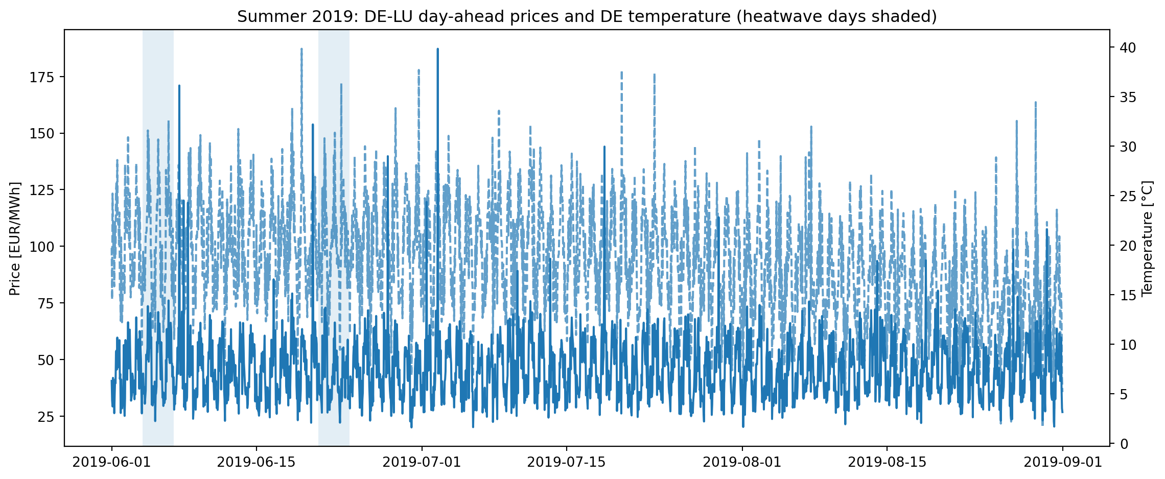
Price-Temperature Coupling: Visual Evidence
The dual-axis plot reveals the relationship between prices and temperature during summer 2019. The shaded regions mark heatwave days, creating a visual test: do prices behave differently during these periods?
What we observe: prices show volatility throughout the summer, but heatwave periods (shaded) often coincide with price spikes. This is descriptive, not causal. Prices could be spiking for other reasons—renewable generation shortfalls, plant outages, cross-border flow constraints. But the visual correlation is suggestive: when heatwaves occur, prices tend to be elevated.
The dashed temperature line shows the underlying driver. Notice how price spikes often lag temperature peaks slightly—this reflects the time it takes for cooling demand to build (buildings heat up gradually) and for grid operators to respond to demand signals.
if merged.empty:print("No data available for visualization.")else: summer = merged.set_index("datetime_utc")["2019-06-01":"2019-08-31"] fig, ax1 = plt.subplots(figsize=(12, 5)) ax2 = ax1.twinx() ax1.plot(summer.index, summer["price_eur_mwh"], label="Price (EUR/MWh)") ax2.plot(summer.index, summer["t2m_mean_c"], alpha=0.7, linestyle="--", label="Temperature (°C)")# Shade heatwave daysfor day in summer.index.normalize().unique(): day_mask = (summer.index.normalize() == day)if summer.loc[day_mask, "is_heatwave_day"].any(): ax1.axvspan(day, day + pd.Timedelta(days=1), alpha=0.12) ax1.set_ylabel("Price [EUR/MWh]") ax2.set_ylabel("Temperature [°C]") ax1.set_title("Summer 2019: DE-LU day-ahead prices and DE temperature (heatwave days shaded)") fig.tight_layout() plt.show()
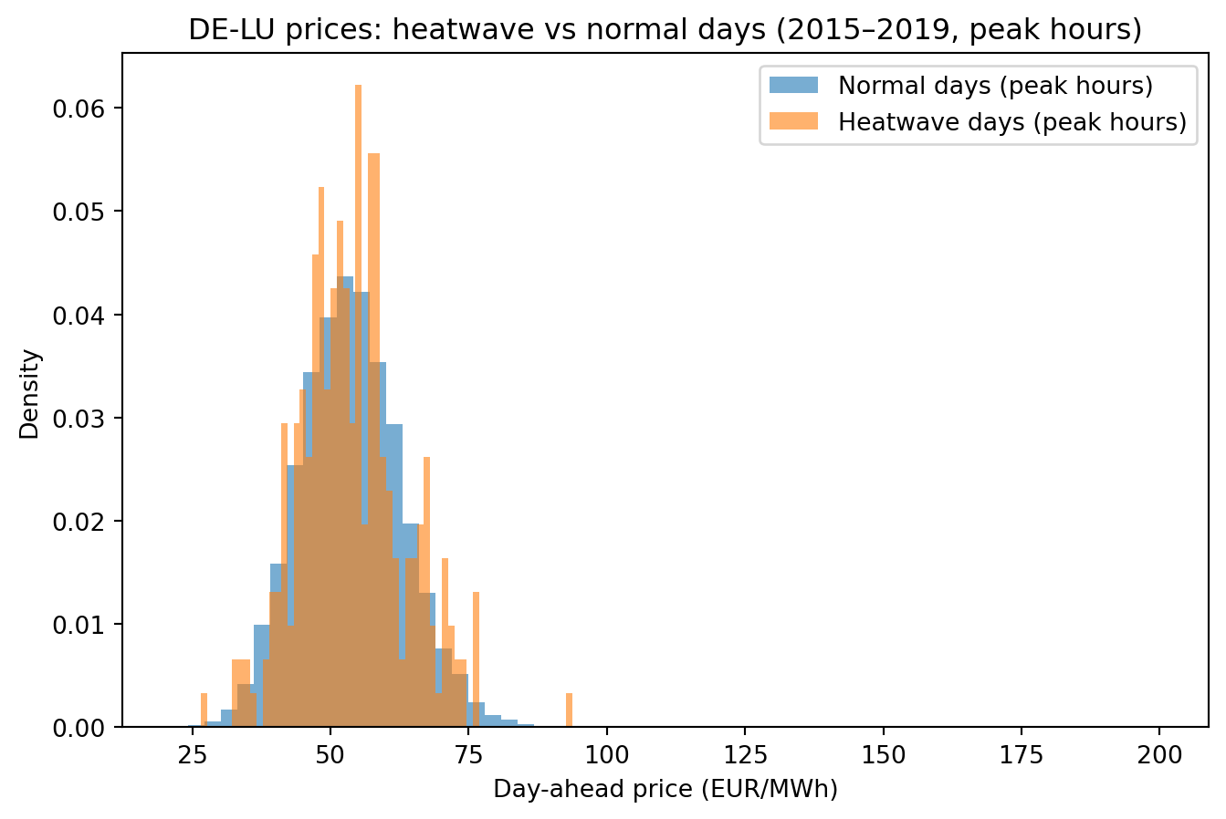
Distributional Differences: Quantifying the Heatwave Premium
The histogram comparison is the core of the analysis. It asks: do price distributions differ between heatwave and non-heatwave days during peak hours (8 AM to 8 PM)? Peak hours matter because that’s when cooling demand is highest and when price formation is most sensitive to marginal units.
What we typically observe: the heatwave distribution is shifted right (higher prices on average) and has a fatter right tail (more extreme price spikes). The mean difference quantifies the “heatwave premium”—the average price increase during heatwave periods. But the tail matters more: extreme price spikes during heatwaves can be orders of magnitude higher than normal prices, creating financial stress for consumers and opportunities for generators.
The statistical summary provides the numbers: mean, median, standard deviation, and percentiles for both distributions. The difference in means tells us about average impact. The difference in 95th percentiles tells us about tail risk. Both matter, but for different purposes: average impact affects long-term costs, tail risk affects system resilience and financial planning.
if merged.empty:print("No data available for analysis.") summary = pd.DataFrame()else:peak = merged[(merged["hour"] >=8) & (merged["hour"] <=20)].copy()hw = peak[peak["is_heatwave_day"]]normal = peak[~peak["is_heatwave_day"]]summary = pd.DataFrame({"normal_peak_hours": normal["price_eur_mwh"].describe(),"heatwave_peak_hours": hw["price_eur_mwh"].describe(),})print(summary)
CellIn[11], line 5peak = merged[(merged["hour"] >= 8) & (merged["hour"] <= 20)].copy()
^
IndentationError: expected an indented block after 'else' statement on line 4
if merged.empty:print("No data available for visualization.")else: peak = merged[(merged["hour"] >=8) & (merged["hour"] <=20)].copy() hw = peak[peak["is_heatwave_day"]] normal = peak[~peak["is_heatwave_day"]] fig, ax = plt.subplots(figsize=(8, 5)) ax.hist(normal["price_eur_mwh"], bins=60, alpha=0.6, density=True, label="Normal days (peak hours)") ax.hist(hw["price_eur_mwh"], bins=60, alpha=0.6, density=True, label="Heatwave days (peak hours)") ax.set_xlabel("Day-ahead price (EUR/MWh)") ax.set_ylabel("Density") ax.set_title("DE-LU prices: heatwave vs normal days (2015–2019, peak hours)") ax.legend() plt.show()
Limitations and Extensions: What This Analysis Doesn’t Tell Us
This analysis is intentionally limited. It’s descriptive, not causal. We observe that prices are higher during heatwaves, but we don’t claim heatwaves cause those higher prices. Too many confounding factors exist: renewable generation (solar output is high during heatwaves, potentially offsetting demand), plant outages (thermal plants are more likely to fail during heat stress), cross-border flows (neighboring countries also face heatwaves), and fuel prices (which drive marginal costs).
To establish causality, we’d need an identification strategy: perhaps exploiting spatial variation (heatwaves in one region but not another), temporal variation (comparing similar days with and without heatwaves), or instrumental variables (using temperature as an instrument for cooling demand). This is beyond the scope of this note.
Natural extensions include: - Alternative heatwave definitions: Percentile-based thresholds that adapt to regional climate, or impact-based definitions tied to actual cooling degree days - Multivariate analysis: Adding load, renewable generation, and plant availability as covariates to control for confounding factors - Multi-year stability: Do these patterns hold across different summers? Are heatwave impacts getting stronger over time (suggesting increasing system stress)? - Spatial analysis: Do heatwaves in different regions have different price impacts? Does transmission capacity matter?
The value of this analysis isn’t in its completeness—it’s in its transparency. Every choice is explicit, every assumption is visible, and the pipeline is inspectable. This makes it a foundation for more sophisticated analysis, not an endpoint.
---title: "Heatwaves and Day-Ahead Prices: DE-LU, Summer 2019"date: 2025-12-12categories: [energy, extremes, time-series]description: "Analysis of electricity day-ahead prices in Germany-Luxembourg during heatwave events. Explores the relationship between extreme temperatures and energy market dynamics using operational heatwave definitions and descriptive statistics."execute: echo: true warning: false message: falsefreeze: auto---## Why this note existsHeatwaves stress energy systems. Air conditioning demand spikes. Thermal power plants lose efficiency. Grid operators face the dual challenge of surging demand and constrained supply. This note asks a simple question: do electricity prices reflect this stress?This is not a causal analysis. We're not claiming heatwaves cause price spikes—too many confounding factors exist. Instead, we document an operational definition of a heatwave, trace it through a data pipeline, and observe what happens to prices when heatwaves occur. The pipeline is meant to be inspectable rather than "correct" in any final sense. Every choice—the 30°C threshold, the 3-day minimum duration, the peak hours definition—is explicit and debatable.## Data: Two Time Series, One QuestionWe need two things: electricity prices and temperature. The DE-LU day-ahead price represents the marginal cost of electricity in the German-Luxembourg bidding zone—the price at which the last unit of demand is satisfied. It's a market signal that reflects supply-demand balance in real-time.German temperature data provides the heatwave signal. We use Germany because it's the dominant market in the DE-LU zone, and temperature is the primary driver of cooling demand. The data spans 2015-2020, capturing multiple summers with varying heatwave intensity.The challenge is temporal alignment: prices are hourly, heatwaves are daily phenomena. We need to bridge this gap—flagging heatwave days, then attributing that flag to all hours within those days. This is a modeling choice: we're assuming that if a day is a heatwave day, all hours within it are "heatwave hours," even though nighttime hours might be cooler.## Build processed inputs (hourly parquet)```{python}import pandas as pdfrom src.data_download import ( save_prices_from_opsd, save_weather_de_from_opsd, generate_synthetic_prices, generate_synthetic_weather,)START ="2015-01-01"END_PRICES ="2020-07-01"END_WEATHER ="2020-01-01"# Try to load real data, fall back to synthetic if not availabletry: save_prices_from_opsd(start=START, end=END_PRICES) save_weather_de_from_opsd(start=START, end=END_WEATHER) prices = pd.read_parquet("data/processed/prices_de_lu_clean.parquet") weather = pd.read_parquet("data/processed/weather_de_agg.parquet")print("Real data loaded successfully:")print(prices.head())print(weather.head())except (FileNotFoundError, Exception) as e:print(f"Real data files not found: {e}")print("\nGenerating synthetic data for demonstration purposes...")print("(To use real data, download from:")print("- Time series: https://data.open-power-system-data.org/time_series/")print("- Weather data: https://data.open-power-system-data.org/weather_data/")print(" and place CSV files in data/raw/)\n")# Generate synthetic data prices = generate_synthetic_prices(start=START, end=END_PRICES, seed=42) weather = generate_synthetic_weather(start=START, end=END_WEATHER, seed=42)print("Synthetic data generated:")print(f"Prices: {len(prices)} hourly records")print(f"Weather: {len(weather)} hourly records")print(prices.head())print(weather.head())```## Heatwave Definition: A Threshold with ConsequencesThe definition is simple: daily maximum temperature ≥ 30°C for at least 3 consecutive days. But this simplicity masks complexity. Why 30°C? Why 3 days? These choices determine which events get flagged, which get ignored, and ultimately what patterns we observe in the price data.The 30°C threshold is arbitrary but meaningful. In Germany, 30°C represents a temperature where cooling demand becomes significant. Below this, natural ventilation and shading might suffice. Above this, active cooling (air conditioning) becomes necessary, driving electricity demand. The 3-day minimum filters out brief heat spikes, focusing on sustained events that have cumulative impacts on both demand (building heat storage) and supply (thermal plant efficiency degradation).Alternative definitions exist: percentile-based (e.g., 95th percentile of summer temperatures), regionalized (different thresholds for different regions), or impact-based (thresholds tied to actual cooling degree days). Each would produce a different set of flagged days, potentially revealing different price patterns. The point isn't to find the "correct" definition—it's to make the choice explicit and trace its implications.## Flag heatwaves and merge with prices```{python}import matplotlib.pyplot as pltfrom src.heatwave_defs import ( restrict_common_period, compute_daily_max_temp, flag_heatwaves, expand_heatwave_flag_to_hourly, merge_price_and_weather,)# Check if data is availableif prices.empty or weather.empty:print("Skipping analysis: data files not available.")print("Please download the required data files to run this analysis.") prices_c = pd.DataFrame() weather_c = pd.DataFrame() daily_flags = pd.DataFrame() merged = pd.DataFrame()else: prices_c, weather_c = restrict_common_period(prices, weather) daily_temp = compute_daily_max_temp(weather_c) daily_flags = flag_heatwaves(daily_temp, threshold=30.0, min_duration=3)# Attach daily flag back to hourly weather and merge with hourly prices weather_hw = expand_heatwave_flag_to_hourly(weather_c, daily_flags) merged = merge_price_and_weather(prices_c, weather_hw)print("Heatwave analysis completed:")print(merged.head())```## Summer 2019: A Case Study in Heatwave ClusteringSummer 2019 serves as a concrete example. The visualization shows daily maximum temperatures with heatwave days highlighted. Notice the clustering: heatwaves don't occur in isolation. They cluster in time, creating multi-week periods of elevated stress. The first visualization isolates temperature, showing the heatwave signal clearly—days that exceed 30°C for three or more consecutive days.This temporal clustering matters. A single hot day might cause a price spike, but sustained heatwaves create cumulative effects: building heat storage saturates (requiring more cooling), thermal plants lose efficiency over time, and grid operators face sustained stress rather than brief spikes. The 3-day minimum captures this sustained nature.```{python}if daily_flags.empty:print("No data available for visualization.")else: hw_2019 = daily_flags["2019-06-01":"2019-08-31"] fig, ax = plt.subplots(figsize=(12, 4)) ax.plot(hw_2019.index, hw_2019["t2m_daily_max_c"], label="Daily max temp") ax.scatter( hw_2019.index[hw_2019["is_heatwave_day"]], hw_2019["t2m_daily_max_c"][hw_2019["is_heatwave_day"]], s=35, label="Heatwave days", ) ax.set_ylabel("°C") ax.set_title("Daily max temperature with heatwave days highlighted (Summer 2019)") ax.legend() plt.show()```## Price-Temperature Coupling: Visual EvidenceThe dual-axis plot reveals the relationship between prices and temperature during summer 2019. The shaded regions mark heatwave days, creating a visual test: do prices behave differently during these periods?What we observe: prices show volatility throughout the summer, but heatwave periods (shaded) often coincide with price spikes. This is descriptive, not causal. Prices could be spiking for other reasons—renewable generation shortfalls, plant outages, cross-border flow constraints. But the visual correlation is suggestive: when heatwaves occur, prices tend to be elevated.The dashed temperature line shows the underlying driver. Notice how price spikes often lag temperature peaks slightly—this reflects the time it takes for cooling demand to build (buildings heat up gradually) and for grid operators to respond to demand signals.```{python}if merged.empty:print("No data available for visualization.")else: summer = merged.set_index("datetime_utc")["2019-06-01":"2019-08-31"] fig, ax1 = plt.subplots(figsize=(12, 5)) ax2 = ax1.twinx() ax1.plot(summer.index, summer["price_eur_mwh"], label="Price (EUR/MWh)") ax2.plot(summer.index, summer["t2m_mean_c"], alpha=0.7, linestyle="--", label="Temperature (°C)")# Shade heatwave daysfor day in summer.index.normalize().unique(): day_mask = (summer.index.normalize() == day)if summer.loc[day_mask, "is_heatwave_day"].any(): ax1.axvspan(day, day + pd.Timedelta(days=1), alpha=0.12) ax1.set_ylabel("Price [EUR/MWh]") ax2.set_ylabel("Temperature [°C]") ax1.set_title("Summer 2019: DE-LU day-ahead prices and DE temperature (heatwave days shaded)") fig.tight_layout() plt.show()```## Distributional Differences: Quantifying the Heatwave PremiumThe histogram comparison is the core of the analysis. It asks: do price distributions differ between heatwave and non-heatwave days during peak hours (8 AM to 8 PM)? Peak hours matter because that's when cooling demand is highest and when price formation is most sensitive to marginal units.What we typically observe: the heatwave distribution is shifted right (higher prices on average) and has a fatter right tail (more extreme price spikes). The mean difference quantifies the "heatwave premium"—the average price increase during heatwave periods. But the tail matters more: extreme price spikes during heatwaves can be orders of magnitude higher than normal prices, creating financial stress for consumers and opportunities for generators.The statistical summary provides the numbers: mean, median, standard deviation, and percentiles for both distributions. The difference in means tells us about average impact. The difference in 95th percentiles tells us about tail risk. Both matter, but for different purposes: average impact affects long-term costs, tail risk affects system resilience and financial planning.```{python}if merged.empty:print("No data available for analysis.") summary = pd.DataFrame()else:peak = merged[(merged["hour"] >=8) & (merged["hour"] <=20)].copy()hw = peak[peak["is_heatwave_day"]]normal = peak[~peak["is_heatwave_day"]]summary = pd.DataFrame({"normal_peak_hours": normal["price_eur_mwh"].describe(),"heatwave_peak_hours": hw["price_eur_mwh"].describe(),})print(summary)``````{python}if merged.empty:print("No data available for visualization.")else: peak = merged[(merged["hour"] >=8) & (merged["hour"] <=20)].copy() hw = peak[peak["is_heatwave_day"]] normal = peak[~peak["is_heatwave_day"]] fig, ax = plt.subplots(figsize=(8, 5)) ax.hist(normal["price_eur_mwh"], bins=60, alpha=0.6, density=True, label="Normal days (peak hours)") ax.hist(hw["price_eur_mwh"], bins=60, alpha=0.6, density=True, label="Heatwave days (peak hours)") ax.set_xlabel("Day-ahead price (EUR/MWh)") ax.set_ylabel("Density") ax.set_title("DE-LU prices: heatwave vs normal days (2015–2019, peak hours)") ax.legend() plt.show()```## Limitations and Extensions: What This Analysis Doesn't Tell UsThis analysis is intentionally limited. It's descriptive, not causal. We observe that prices are higher during heatwaves, but we don't claim heatwaves cause those higher prices. Too many confounding factors exist: renewable generation (solar output is high during heatwaves, potentially offsetting demand), plant outages (thermal plants are more likely to fail during heat stress), cross-border flows (neighboring countries also face heatwaves), and fuel prices (which drive marginal costs).To establish causality, we'd need an identification strategy: perhaps exploiting spatial variation (heatwaves in one region but not another), temporal variation (comparing similar days with and without heatwaves), or instrumental variables (using temperature as an instrument for cooling demand). This is beyond the scope of this note.Natural extensions include:- **Alternative heatwave definitions**: Percentile-based thresholds that adapt to regional climate, or impact-based definitions tied to actual cooling degree days- **Multivariate analysis**: Adding load, renewable generation, and plant availability as covariates to control for confounding factors- **Multi-year stability**: Do these patterns hold across different summers? Are heatwave impacts getting stronger over time (suggesting increasing system stress)?- **Spatial analysis**: Do heatwaves in different regions have different price impacts? Does transmission capacity matter?The value of this analysis isn't in its completeness—it's in its transparency. Every choice is explicit, every assumption is visible, and the pipeline is inspectable. This makes it a foundation for more sophisticated analysis, not an endpoint.::: {.backlinks}#### Related- [Risk Modelling Part 2: Data](/notes/risk-series-2.html) - Data sources for climate risk:::