---
title: "Climate Extremes Explorer"
date: 2025-12-15
categories: [climate, extremes, analysis, visualization]
description: "Comprehensive interactive analysis of climate extremes using synthetic climate data. Demonstrates methods for identifying, analyzing, and visualizing extreme climate events including heatwaves, cold snaps, and extreme precipitation. Features return period analysis, event clustering, and multi-variable correlation analysis."
execute:
echo: true
warning: false
message: false
freeze: auto
---
## Overview
Extreme climate events—heatwaves, cold snaps, extreme precipitation—are not anomalies to be dismissed as outliers. They are the signal. Understanding their frequency, intensity, and co-occurrence patterns is fundamental to climate risk assessment. This analysis applies extreme value theory and multivariate statistics to extract structure from what appears chaotic.
The framework demonstrates:
- **Extreme Event Identification** - Multiple methods (percentile, absolute, anomaly)
- **Return Period Analysis** - Extreme value theory (Block Maxima, Peaks Over Threshold)
- **Multi-Variable Correlation** - Relationships between climate variables
- **Event Clustering** - Hierarchical clustering of extreme events
- **Statistical Analysis** - Comprehensive extreme event statistics
## Building the Foundation: Synthetic Climate Data
Before we can identify extremes, we need a baseline. Synthetic data generation here serves two purposes: it provides a controlled environment to test methods, and it demonstrates how realistic climate variability can emerge from relatively simple stochastic processes. The data spans 24 years (2000-2023) with daily resolution, capturing temperature, precipitation, and atmospheric pressure—three variables that interact in complex ways.
The synthetic generation incorporates:
- **Seasonal cycles** (annual temperature variation, precipitation patterns)
- **Inter-annual variability** (year-to-year fluctuations)
- **Cross-variable dependencies** (temperature-precipitation relationships)
- **Autocorrelation** (weather persistence over days)
This isn't "fake data" in the pejorative sense—it's a generative model that captures the statistical structure of real climate systems. When we later identify extremes, we're finding events that would be rare under this baseline distribution.
### Generate and Load Climate Data
```{python}
import numpy as np
import pandas as pd
import matplotlib.pyplot as plt
try:
    import seaborn as sns
    HAS_SEABORN = True
except ImportError:
    HAS_SEABORN = False
    print("Note: seaborn not available, using matplotlib for heatmap")
from scipy import stats

from src.climate_extremes import (
    generate_synthetic_climate_data,
    identify_extremes,
    compute_return_periods,
    analyze_correlations,
    cluster_extreme_events,
    compute_extreme_statistics,
)

# Generate synthetic climate data (2000-2023, daily)
print("Generating synthetic climate data...")
climate_data = generate_synthetic_climate_data(
    start_date="2000-01-01",
    end_date="2023-12-31",
    freq="D",
    seed=42
)

print(f"\nData shape: {climate_data.shape}")
print(f"Date range: {climate_data['datetime_utc'].min()} to {climate_data['datetime_utc'].max()}")
print("\nFirst few rows:")
print(climate_data.head())
print("\nSummary statistics:")
print(climate_data[['temperature_c', 'precipitation_mm', 'pressure_hpa']].describe())
```
## Defining the Extreme: Operational Thresholds
What counts as "extreme" is not a question with a single answer. It's a modeling choice with real consequences. We use the 95th percentile threshold—meaning 5% of days exceed this value—but this is arbitrary. A heatwave that's extreme in one region might be normal in another. A 3-day minimum duration filters out single-day spikes, focusing on sustained events that have greater impact.
The choice of method matters:
- **Percentile-based**: Relative to the local distribution (adapts to regional climate)
- **Absolute thresholds**: Fixed values (e.g., 30°C) that ignore local context
- **Anomaly-based**: Deviations from expected seasonal patterns
Here, we use percentile thresholds because they're scale-invariant and adapt to the data's inherent variability. A 95th percentile heatwave in a temperate region might be 28°C, while in a desert it might be 42°C—both are equally "extreme" relative to their contexts.
### Identify Extreme Events
```{python}
# Identify extreme temperature events (95th percentile, minimum 3 consecutive days)
climate_data = identify_extremes(
    climate_data,
    variable='temperature_c',
    method='percentile',
    threshold=95.0,
    min_duration=3
)

# Also identify extreme precipitation events
climate_data = identify_extremes(
    climate_data,
    variable='precipitation_mm',
    method='percentile',
    threshold=95.0,
    min_duration=1
)

# Compute statistics
temp_stats = compute_extreme_statistics(climate_data, 'temperature_c')
precip_stats = compute_extreme_statistics(climate_data, 'precipitation_mm')

print("Temperature Extreme Events:")
print(f"  Number of events: {temp_stats['n_events']}")
print(f"  Total extreme days: {temp_stats['total_days']}")
print(f"  Mean intensity: {temp_stats['mean_intensity']:.2f}°C above threshold")
print(f"  Maximum intensity: {temp_stats['max_intensity']:.2f}°C above threshold")
print(f"  Mean duration: {temp_stats['mean_duration']:.1f} days")

print("\nPrecipitation Extreme Events:")
print(f"  Number of events: {precip_stats['n_events']}")
print(f"  Total extreme days: {precip_stats['total_days']}")
print(f"  Mean intensity: {precip_stats['mean_intensity']:.2f} mm above threshold")
print(f"  Maximum intensity: {precip_stats['max_intensity']:.2f} mm above threshold")
```
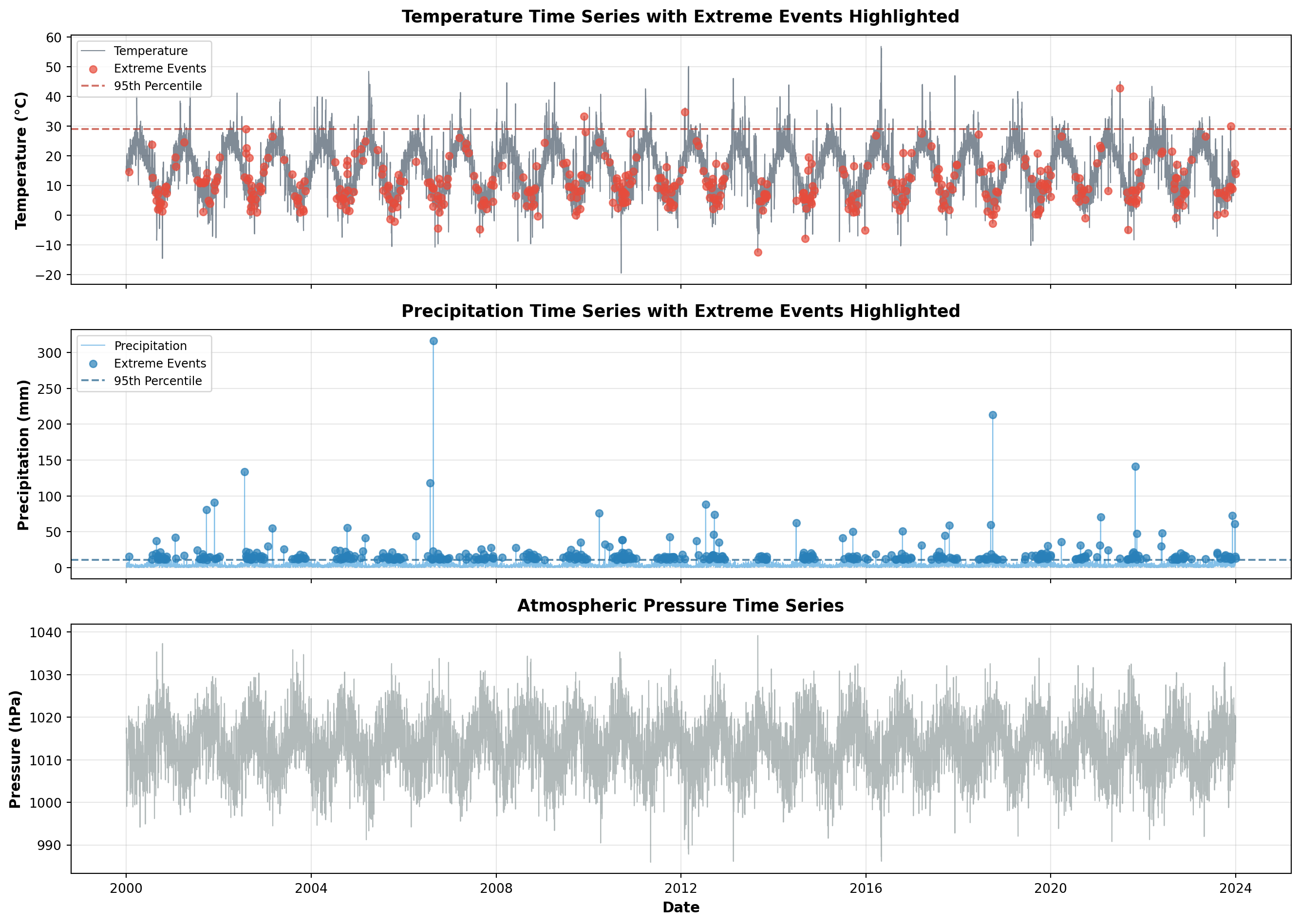
## Temporal Patterns: When Extremes Occur
The timeline visualization reveals something crucial: extreme events are not uniformly distributed. They cluster in time, creating periods of elevated risk. The temperature extremes show clear seasonal patterns—heatwaves in summer, cold snaps in winter—but also reveal inter-annual variability. Some years are quiet; others are punctuated by multiple extreme events.
This temporal clustering has implications for risk assessment. If extremes were independent random events, we could model them with simple Poisson processes. But they're not. They exhibit persistence (heatwaves last multiple days) and clustering (extreme years contain multiple extreme events). This means risk is not constant—it's time-varying and state-dependent.
The visualization also shows the relationship between variables. Notice how extreme precipitation events sometimes coincide with temperature extremes (convective storms during heatwaves), and sometimes don't (frontal systems during cooler periods). This co-occurrence—or lack thereof—matters for compound risk assessment.
```{python}
# Create timeline visualization with extreme events highlighted
fig, axes = plt.subplots(3, 1, figsize=(14, 10), sharex=True)

# Temperature with extreme events
ax1 = axes[0]
ax1.plot(climate_data['datetime_utc'], climate_data['temperature_c'],
         color='#2c3e50', alpha=0.6, linewidth=0.8, label='Temperature')
ax1.scatter(climate_data[climate_data['is_extreme']]['datetime_utc'],
           climate_data[climate_data['is_extreme']]['temperature_c'],
           c='#e74c3c', s=30, alpha=0.7, label='Extreme Events', zorder=5)
ax1.axhline(y=np.percentile(climate_data['temperature_c'], 95),
           color='#c0392b', linestyle='--', alpha=0.7, label='95th Percentile')
ax1.set_ylabel('Temperature (°C)', fontsize=11, fontweight='bold')
ax1.set_title('Temperature Time Series with Extreme Events Highlighted',
              fontsize=13, fontweight='bold', pad=10)
ax1.legend(loc='upper left', fontsize=9)
ax1.grid(True, alpha=0.3)

# Precipitation with extreme events
ax2 = axes[1]
ax2.plot(climate_data['datetime_utc'], climate_data['precipitation_mm'],
         color='#3498db', alpha=0.6, linewidth=0.8, label='Precipitation')
precip_extremes = climate_data[climate_data['precipitation_mm'] >=
                               np.percentile(climate_data['precipitation_mm'], 95)]
ax2.scatter(precip_extremes['datetime_utc'], precip_extremes['precipitation_mm'],
           c='#2980b9', s=30, alpha=0.7, label='Extreme Events', zorder=5)
ax2.axhline(y=np.percentile(climate_data['precipitation_mm'], 95),
           color='#21618c', linestyle='--', alpha=0.7, label='95th Percentile')
ax2.set_ylabel('Precipitation (mm)', fontsize=11, fontweight='bold')
ax2.set_title('Precipitation Time Series with Extreme Events Highlighted',
              fontsize=13, fontweight='bold', pad=10)
ax2.legend(loc='upper left', fontsize=9)
ax2.grid(True, alpha=0.3)

# Pressure
ax3 = axes[2]
ax3.plot(climate_data['datetime_utc'], climate_data['pressure_hpa'],
         color='#7f8c8d', alpha=0.6, linewidth=0.8)
ax3.set_ylabel('Pressure (hPa)', fontsize=11, fontweight='bold')
ax3.set_xlabel('Date', fontsize=11, fontweight='bold')
ax3.set_title('Atmospheric Pressure Time Series',
              fontsize=13, fontweight='bold', pad=10)
ax3.grid(True, alpha=0.3)

plt.tight_layout()
plt.show()
```
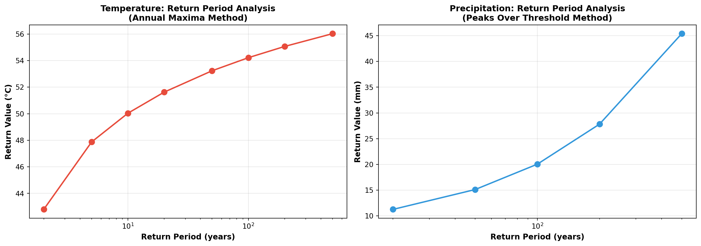
## Return Periods: Quantifying Rarity
Return period analysis answers a deceptively simple question: "How often should we expect an event of this magnitude?" A 100-year return period doesn't mean it happens exactly once per century—it means the annual probability is 1%. Over a 100-year period, there's a 63% chance of experiencing at least one such event (due to the compounding of probabilities).
The two methods shown here capture different aspects of extremes:
- **Block Maxima (Annual Maxima)**: Takes the maximum value each year, fits a Generalized Extreme Value (GEV) distribution. Good for understanding the worst-case scenario in any given year.
- **Peaks Over Threshold**: Identifies all values above a threshold, fits a Generalized Pareto Distribution (GPD). More data-efficient, captures multiple extremes per year.
The log-scale x-axis is intentional. Return periods follow a power-law relationship—doubling the return period doesn't double the intensity. The curve flattens, meaning truly catastrophic events (1000-year return periods) are only marginally more intense than 100-year events, but exponentially rarer.
This analysis is the foundation of engineering design standards (dams, bridges, flood defenses) and insurance pricing. The "100-year flood" isn't a prediction—it's a risk metric.
```{python}
# Compute return periods for temperature extremes
return_periods_temp = compute_return_periods(
    climate_data,
    variable='temperature_c',
    method='block_maxima',
    block_size='1Y'
)

return_periods_precip = compute_return_periods(
    climate_data,
    variable='precipitation_mm',
    method='peaks_over_threshold',
)

fig, axes = plt.subplots(1, 2, figsize=(14, 5))

# Temperature return periods
ax1 = axes[0]
ax1.plot(return_periods_temp['return_period_years'],
        return_periods_temp['return_value'],
        marker='o', linewidth=2, markersize=8, color='#e74c3c')
ax1.set_xlabel('Return Period (years)', fontsize=11, fontweight='bold')
ax1.set_ylabel('Return Value (°C)', fontsize=11, fontweight='bold')
ax1.set_title('Temperature: Return Period Analysis\n(Annual Maxima Method)',
              fontsize=12, fontweight='bold')
ax1.grid(True, alpha=0.3)
ax1.set_xscale('log')

# Precipitation return periods
ax2 = axes[1]
ax2.plot(return_periods_precip['return_period_years'],
        return_periods_precip['return_value'],
        marker='o', linewidth=2, markersize=8, color='#3498db')
ax2.set_xlabel('Return Period (years)', fontsize=11, fontweight='bold')
ax2.set_ylabel('Return Value (mm)', fontsize=11, fontweight='bold')
ax2.set_title('Precipitation: Return Period Analysis\n(Peaks Over Threshold Method)',
              fontsize=12, fontweight='bold')
ax2.grid(True, alpha=0.3)
ax2.set_xscale('log')

plt.tight_layout()
plt.show()

print("Return Period Analysis Results:")
print("\nTemperature (Annual Maxima):")
print(return_periods_temp.to_string(index=False))
print("\nPrecipitation (Peaks Over Threshold):")
print(return_periods_precip.to_string(index=False))
```
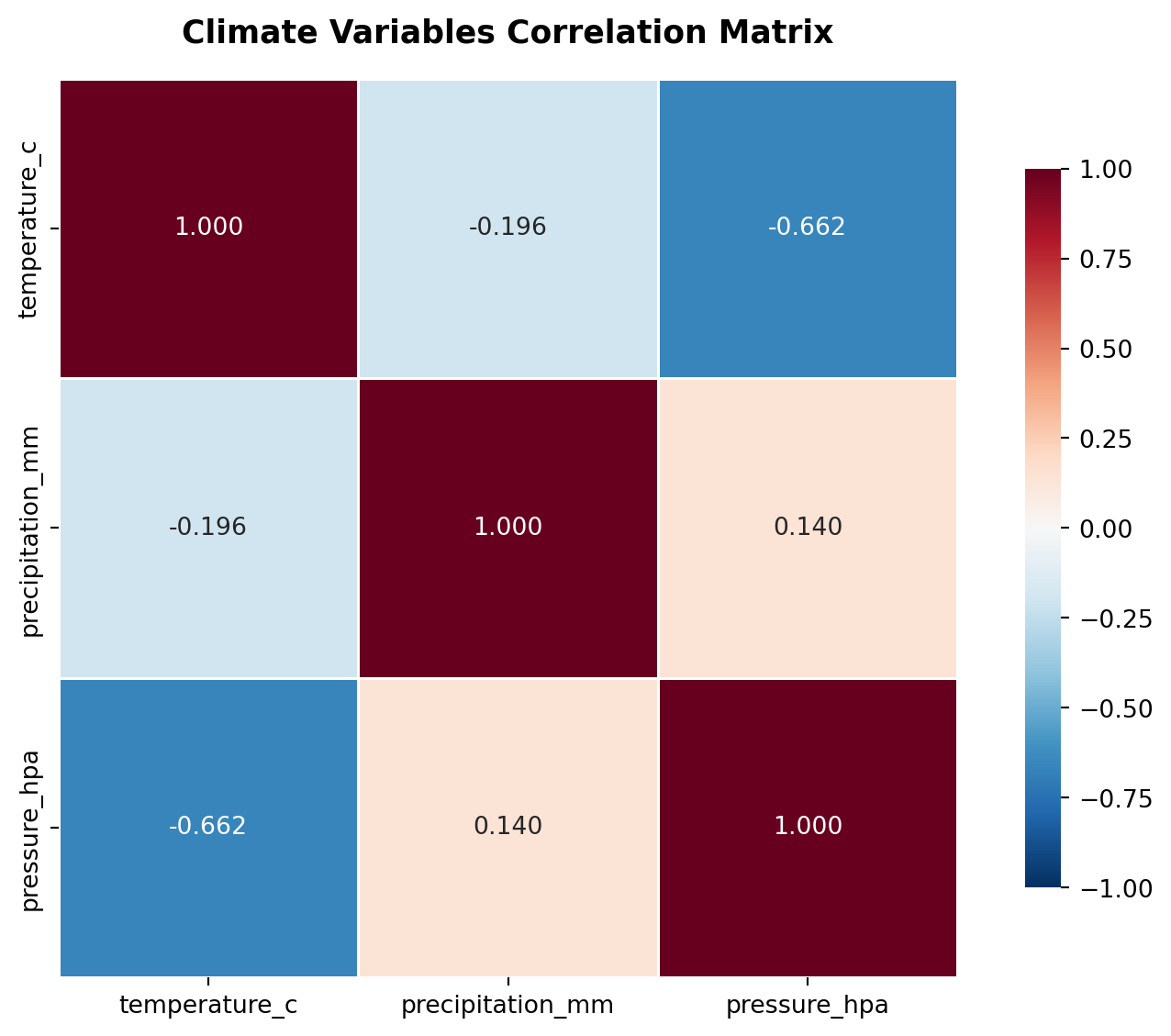
## Correlation Structure: When Variables Move Together
Climate variables don't exist in isolation. Temperature, precipitation, and pressure are coupled through physical processes. The correlation matrix quantifies these relationships, but the interpretation requires care.
A negative correlation between temperature and precipitation might seem counterintuitive, but it reflects the physics: high-pressure systems (clear skies, high temperatures) suppress precipitation, while low-pressure systems (clouds, precipitation) moderate temperatures. The strength of these correlations varies by season and region.
Why this matters: if variables are correlated, extreme events in one variable are more likely to co-occur with extremes in another. This creates compound risks that simple univariate analysis misses. A heatwave coinciding with low precipitation creates drought stress. A cold snap with high precipitation creates ice storms. The correlation structure tells us which compound events are physically plausible and which are unlikely.
```{python}
# Compute correlation matrix
corr_matrix = analyze_correlations(
    climate_data,
    variables=['temperature_c', 'precipitation_mm', 'pressure_hpa']
)

# Create heatmap
fig, ax = plt.subplots(figsize=(8, 6))
if HAS_SEABORN:
    sns.heatmap(corr_matrix, annot=True, fmt='.3f', cmap='RdBu_r', center=0,
               square=True, linewidths=1, cbar_kws={"shrink": 0.8},
               vmin=-1, vmax=1, ax=ax)
else:
    im = ax.imshow(corr_matrix.values, cmap='RdBu_r', vmin=-1, vmax=1, aspect='auto')
    ax.set_xticks(range(len(corr_matrix.columns)))
    ax.set_yticks(range(len(corr_matrix.index)))
    ax.set_xticklabels(corr_matrix.columns)
    ax.set_yticklabels(corr_matrix.index)
    for i in range(len(corr_matrix.index)):
        for j in range(len(corr_matrix.columns)):
            ax.text(j, i, f'{corr_matrix.iloc[i, j]:.3f}',
                   ha='center', va='center', color='black' if abs(corr_matrix.iloc[i, j]) < 0.5 else 'white')
    plt.colorbar(im, ax=ax, shrink=0.8)
ax.set_title('Climate Variables Correlation Matrix',
             fontsize=13, fontweight='bold', pad=15)
plt.tight_layout()
plt.show()

print("\nCorrelation Matrix:")
print(corr_matrix)
```
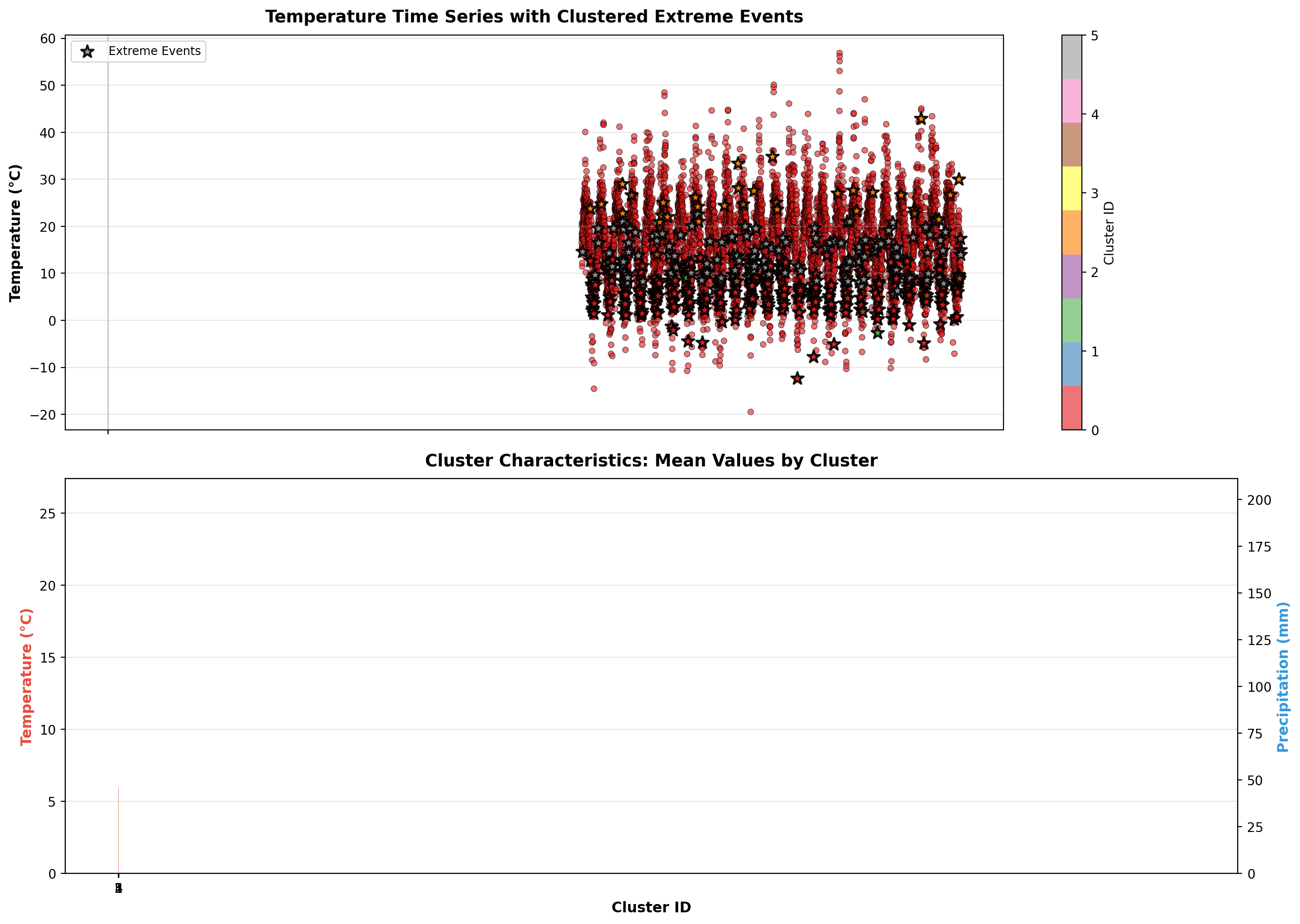
## Event Typology: Clustering Extreme Events
Not all extreme events are the same. Hierarchical clustering groups events by their multi-variable signatures, revealing distinct "types" of extremes. One cluster might represent "dry heatwaves" (high temperature, low precipitation, high pressure), while another represents "humid heatwaves" (high temperature, high precipitation, low pressure).
This typology matters because different event types have different impacts. A dry heatwave increases wildfire risk and water stress. A humid heatwave increases heat stress on humans (reduced evaporative cooling) and can trigger convective storms. The clustering analysis transforms a collection of individual events into a taxonomy of risk scenarios.
The cluster characteristics plot shows the mean conditions for each event type. Notice how clusters differ not just in temperature, but in the full multi-variable space. This is the power of multivariate analysis: it captures patterns that univariate methods miss.
```{python}
# Cluster extreme temperature events
climate_data = cluster_extreme_events(
    climate_data,
    n_clusters=5,
    variables=['temperature_c', 'precipitation_mm', 'pressure_hpa']
)

# Visualize clustered extreme events
fig, axes = plt.subplots(2, 1, figsize=(14, 10), sharex=True)

# Temperature with cluster colors
ax1 = axes[0]
scatter = ax1.scatter(climate_data['datetime_utc'], climate_data['temperature_c'],
                     c=climate_data['extreme_cluster'], cmap='Set1',
                     s=20, alpha=0.6, edgecolors='black', linewidth=0.5)
extreme_mask = climate_data['is_extreme']
ax1.scatter(climate_data[extreme_mask]['datetime_utc'],
           climate_data[extreme_mask]['temperature_c'],
           c=climate_data[extreme_mask]['extreme_cluster'], cmap='Set1',
           s=100, alpha=0.9, edgecolors='black', linewidth=1.5,
           marker='*', zorder=5, label='Extreme Events')
ax1.set_ylabel('Temperature (°C)', fontsize=11, fontweight='bold')
ax1.set_title('Temperature Time Series with Clustered Extreme Events',
              fontsize=13, fontweight='bold', pad=10)
cbar = plt.colorbar(scatter, ax=ax1)
cbar.set_label('Cluster ID', fontsize=10)
ax1.legend(loc='upper left', fontsize=9)
ax1.grid(True, alpha=0.3)

# Cluster characteristics
ax2 = axes[1]
cluster_stats = climate_data[climate_data['extreme_cluster'] > 0].groupby('extreme_cluster').agg({
    'temperature_c': 'mean',
    'precipitation_mm': 'mean',
    'pressure_hpa': 'mean',
    'extreme_intensity': 'mean',
}).reset_index()

x_pos = np.arange(len(cluster_stats))
width = 0.35
ax2.bar(x_pos - width/2, cluster_stats['temperature_c'], width,
       label='Temperature', color='#e74c3c', alpha=0.7)
ax2_twin = ax2.twinx()
ax2_twin.bar(x_pos + width/2, cluster_stats['precipitation_mm'], width,
            label='Precipitation', color='#3498db', alpha=0.7)
ax2.set_xlabel('Cluster ID', fontsize=11, fontweight='bold')
ax2.set_ylabel('Temperature (°C)', fontsize=11, fontweight='bold', color='#e74c3c')
ax2_twin.set_ylabel('Precipitation (mm)', fontsize=11, fontweight='bold', color='#3498db')
ax2.set_title('Cluster Characteristics: Mean Values by Cluster',
              fontsize=13, fontweight='bold', pad=10)
ax2.set_xticks(x_pos)
ax2.set_xticklabels(cluster_stats['extreme_cluster'])
ax2.grid(True, alpha=0.3, axis='y')

plt.tight_layout()
plt.show()

print("\nCluster Statistics:")
print(cluster_stats.to_string(index=False))
```
## Intensity Distribution: The Shape of Extremes
The distribution of extreme event intensities reveals something important: extremes themselves have structure. They're not uniformly distributed—there are "moderate extremes" and "extreme extremes." The histogram shows a right-skewed distribution, meaning most extreme events are relatively mild (just above the threshold), while truly catastrophic events are rare.
The box plots by cluster show that different event types have different intensity distributions. Some clusters have tight distributions (consistent intensity), while others are highly variable. This heterogeneity matters for risk assessment: if you're planning for the "typical extreme," you'll be underprepared for the tail events.
The median being lower than the mean indicates positive skew—the distribution has a long right tail. This is characteristic of extreme value distributions and reflects the physics: there's a lower bound (you can't have negative heat), but no upper bound (temperatures can theoretically get arbitrarily high, though practically limited by energy balance).
```{python}
# Analyze distribution of extreme event intensities
extreme_events = climate_data[climate_data['is_extreme']].copy()

fig, axes = plt.subplots(1, 2, figsize=(14, 5))

# Histogram of extreme intensities
ax1 = axes[0]
ax1.hist(extreme_events['extreme_intensity'], bins=30, color='#e74c3c',
        alpha=0.7, edgecolor='black', linewidth=1.2)
ax1.axvline(extreme_events['extreme_intensity'].mean(),
           color='#c0392b', linestyle='--', linewidth=2,
           label=f"Mean: {extreme_events['extreme_intensity'].mean():.2f}°C")
ax1.axvline(extreme_events['extreme_intensity'].median(),
           color='#8e44ad', linestyle='--', linewidth=2,
           label=f"Median: {extreme_events['extreme_intensity'].median():.2f}°C")
ax1.set_xlabel('Extreme Intensity (°C above threshold)', fontsize=11, fontweight='bold')
ax1.set_ylabel('Frequency', fontsize=11, fontweight='bold')
ax1.set_title('Distribution of Extreme Event Intensities',
              fontsize=12, fontweight='bold')
ax1.legend(fontsize=9)
ax1.grid(True, alpha=0.3, axis='y')

# Box plot by cluster
ax2 = axes[1]
# Get unique cluster IDs (excluding 0) and filter out empty clusters
unique_clusters = sorted([i for i in extreme_events['extreme_cluster'].unique() if i > 0])
cluster_data = []
cluster_labels = []
for i in unique_clusters:
    data = extreme_events[extreme_events['extreme_cluster'] == i]['extreme_intensity'].values
    if len(data) > 0:  # Only include clusters with data
        cluster_data.append(data)
        cluster_labels.append(str(i))

# Only plot if we have data
if len(cluster_data) > 0:
    bp = ax2.boxplot(cluster_data, labels=cluster_labels,
                    patch_artist=True, showmeans=True)
    for patch in bp['boxes']:
        patch.set_facecolor('#e74c3c')
        patch.set_alpha(0.7)
else:
    ax2.text(0.5, 0.5, 'No cluster data available',
            ha='center', va='center', transform=ax2.transAxes)
ax2.set_xlabel('Cluster ID', fontsize=11, fontweight='bold')
ax2.set_ylabel('Extreme Intensity (°C above threshold)', fontsize=11, fontweight='bold')
ax2.set_title('Extreme Intensity Distribution by Cluster',
              fontsize=12, fontweight='bold')
ax2.grid(True, alpha=0.3, axis='y')

plt.tight_layout()
plt.show()

print("\nExtreme Event Intensity Statistics:")
print(extreme_events['extreme_intensity'].describe())
```
## Synthesis: What the Numbers Tell Us
The summary statistics aggregate the analysis into digestible metrics, but the real insights come from understanding how these pieces fit together. The return period analysis tells us about rarity. The clustering tells us about diversity. The correlation structure tells us about co-occurrence. Together, they paint a picture of a climate system where extremes are:
1. **Rare but not random**: They follow statistical distributions that can be modeled
2. **Diverse in type**: Not all extremes are the same—different event types have different impacts
3. **Correlated in space and time**: Variables move together, creating compound risks
4. **Heterogeneous in intensity**: Most extremes are moderate; catastrophic events are exponentially rarer
This framework is the foundation for climate risk assessment. It transforms raw data into actionable intelligence: understanding not just what happened, but what could happen, how often, and in what combinations.
```{python}
# Generate comprehensive summary
print("=" * 70)
print("CLIMATE EXTREMES ANALYSIS SUMMARY")
print("=" * 70)

print(f"\n📊 Dataset Overview:")
print(f"   Period: {climate_data['datetime_utc'].min().date()} to {climate_data['datetime_utc'].max().date()}")
print(f"   Total days: {len(climate_data):,}")
print(f"   Variables: Temperature, Precipitation, Pressure")

print(f"\n🌡️  Temperature Extremes:")
print(f"   Total extreme events: {temp_stats['n_events']}")
print(f"   Extreme days: {temp_stats['total_days']} ({100*temp_stats['total_days']/len(climate_data):.2f}% of period)")
print(f"   Mean intensity: {temp_stats['mean_intensity']:.2f}°C above 95th percentile")
print(f"   Maximum intensity: {temp_stats['max_intensity']:.2f}°C above threshold")
print(f"   Mean duration: {temp_stats['mean_duration']:.1f} days per event")

print(f"\n🌧️  Precipitation Extremes:")
print(f"   Total extreme events: {precip_stats['n_events']}")
print(f"   Extreme days: {precip_stats['total_days']} ({100*precip_stats['total_days']/len(climate_data):.2f}% of period)")
print(f"   Mean intensity: {precip_stats['mean_intensity']:.2f} mm above 95th percentile")
print(f"   Maximum intensity: {precip_stats['max_intensity']:.2f} mm above threshold")

print(f"\n📈 Return Period Analysis:")
print(f"   100-year return temperature: {return_periods_temp[return_periods_temp['return_period_years']==100]['return_value'].values[0]:.2f}°C")
print(f"   100-year return precipitation: {return_periods_precip[return_periods_precip['return_period_years']==100]['return_value'].values[0]:.2f} mm")

print(f"\n🔗 Variable Correlations:")
print(f"   Temperature-Precipitation: {corr_matrix.loc['temperature_c', 'precipitation_mm']:.3f}")
print(f"   Temperature-Pressure: {corr_matrix.loc['temperature_c', 'pressure_hpa']:.3f}")
print(f"   Precipitation-Pressure: {corr_matrix.loc['precipitation_mm', 'pressure_hpa']:.3f}")

print(f"\n🎯 Extreme Event Clusters:")
print(f"   Number of clusters: {climate_data['extreme_cluster'].max()}")
for cluster_id in sorted(cluster_stats['extreme_cluster']):
    cluster_data = climate_data[climate_data['extreme_cluster'] == cluster_id]
    print(f"   Cluster {cluster_id}: {len(cluster_data)} events, "
          f"mean temp {cluster_stats[cluster_stats['extreme_cluster']==cluster_id]['temperature_c'].values[0]:.1f}°C")

print("\n" + "=" * 70)
```
---
## Note
This analysis uses synthetic climate data for demonstration. In production, this framework can be applied to real ERA5 reanalysis data or observational climate datasets. The methods shown here—extreme value theory, return period analysis, and event clustering—are standard approaches in climate risk assessment.